
Jobs -> A look at the 2021 trend
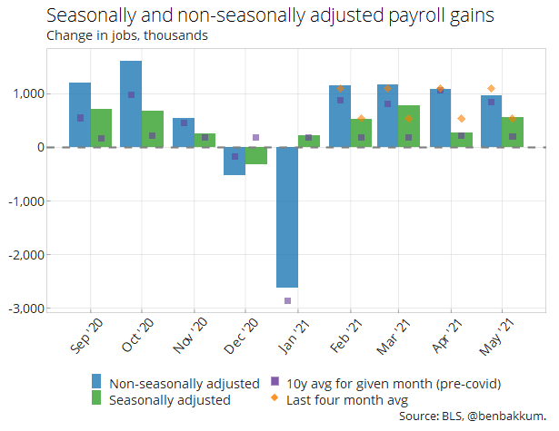
Job gains in May came in closer to analyst expectations relative to the big miss in April, with over half a million jobs added during the month. The chart below shows how the nonfarm payroll numbers have developed over the last nine months, including revisions that have been released for previous reports.
Despite the deceleration in April, the last four months have strung together a fairly consistent trend, with seasonally adjusted job adds averaging around 500,000 and non-seasonally adjusted gains averaging just above 1 million. As Michael Redmond has noted, potentially a “speed limit” exists on just how many jobs can be created in any given month, and these type of averages may be what we should expect going forward for this recovery. While this kind of rebound in the labor market is likely not as strong as many would have hoped, on the bright side the current trend is still much better than the average job growth of the previous cycle.
The chart below compares the seasonally adjusted and non-seasonally adjusted payroll figures, along with what the given month averaged during the last cycle and what the most recent four months have averaged for each.
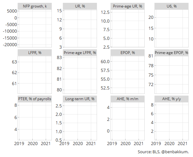
Overall, there was not much to dislike in this specific report, apart from the tick down in participation. Prime-age employment and therefore prime-age EPOP were strong. Prime-age participation was flat, but it was also flat when the overall participation rate rose last month.
| Nov-20 | Dec-20 | Jan-21 | Feb-21 | Mar-21 | Apr-21 | May-21 | |
|---|---|---|---|---|---|---|---|
| NFP growth, k | 264 | -306 | 233 | 536 | 785 | 278 | 559 |
| UR, % | 6.7 | 6.7 | 6.3 | 6.2 | 6 | 6.1 | 5.8 |
| Prime-age UR, % | 6.1 | 5.8 | 5.8 | 5.7 | 5.5 | 5.5 | 5.2 |
| U6, % | 12 | 11.7 | 11.1 | 11.1 | 10.7 | 10.4 | 10.2 |
| LFPR, % | 61.5 | 61.5 | 61.4 | 61.4 | 61.5 | 61.7 | 61.6 |
| Prime-age LFPR, % | 80.9 | 81 | 81.1 | 81.1 | 81.3 | 81.3 | 81.3 |
| EPOP, % | 57.4 | 57.4 | 57.5 | 57.6 | 57.8 | 57.9 | 58 |
| Prime-age EPOP, % | 76 | 76.3 | 76.4 | 76.5 | 76.8 | 76.9 | 77.1 |
| PTER, % of payrolls | 4.4 | 4.1 | 4 | 4.1 | 3.9 | 3.5 | 3.5 |
| Long-term UR, % | 2.4 | 2.5 | 2.5 | 2.6 | 2.6 | 2.6 | 2.3 |
| AHE, % m/m | 0.3 | 1 | 0 | 0.3 | -0.1 | 0.7 | 0.5 |
| AHE, % y/y | 4.5 | 5.5 | 5.2 | 5.2 | 4.3 | 0.4 | 2 |
| Source: BLS, @benbakkum. |
The decrease in the long-term unemployment rate stands out on the charts of these series.
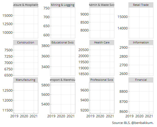
Leisure & hospitality now stringing together a nice trend of job gains over the last few months. Looks like the number of professional service jobs in the economy has now actually surpassed the pre-pandemic peak.
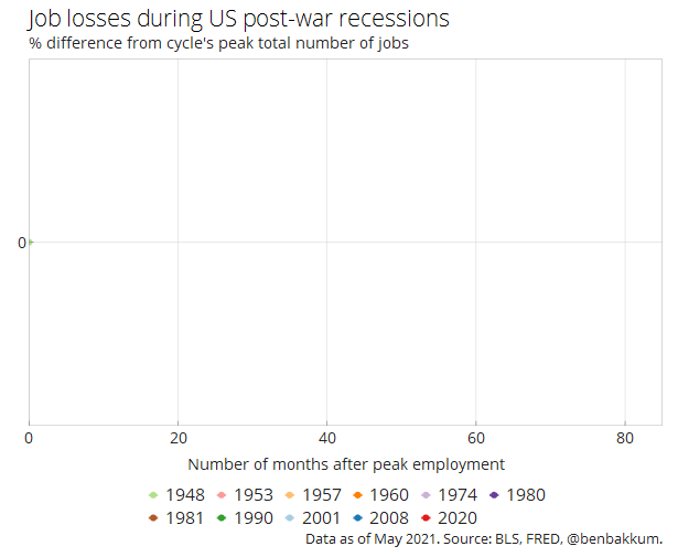
 The recovery in the percentage of jobs lost is reaching the same level of losses as the Global Financial Crisis this far in time from peak employment, when at that point during the previous recession, the labor market was still on the way down.
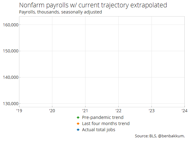
If the average job growth of the last four months discussed above continues indefinitely, the labor market would fully recover to where it would have likely ended up had the pandemic not occurred by the end of 2023.
An aggregate measure of labor market conditions, the Blanchflower-Levin employment gap, shows that a good amount of slack certainly still exists despite the headlines you may see about shortages, but it also indicates that steady progress continues to be made.
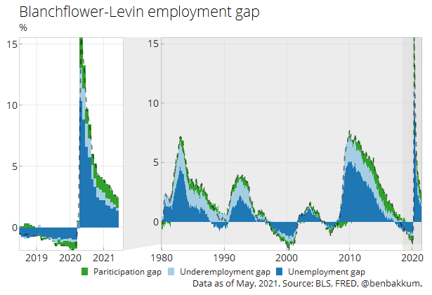
Note: the unemployment gap is the difference between the unemployment rate and the non-accelerating inflation rate of unemployment (NAIRU). The participation gap is the difference between the labor force participation rate (LFPR) and the CBO’s estimate of the potential LFPR. The underemployment gap is the difference between the number of employees working part-time for economic reasons as a percentage of the labor force, adjusted for the difference in the average number of hours worked by part-time and full-time employees, and the 1994-2007 average of this calculation.


