
Prices -> A look under the index's hood
Inflation has reached levels not seen in decades, and it would be an understatement to say that the world’s noticed. There’s a camp that calls inflation’s current clip “Transitory.” There’s a faction pointing to any and all price charts still with an upward trajectory that identifies inflation as “Persistent,” and there’s folks with a slightly more nuanced view that belong to “Team Transitorily Elevated in Pandemic-Affected Categories Followed by a Moderate Broadening Out That’s Unfortunate but Still Much Better than the Alternative That We Experienced after the Last Recession,” as Michael Redmond notes. My goal in this piece is to take a sober look at what the data shows and may be telling us, though I’m likely in large part blind to the extent my biases.
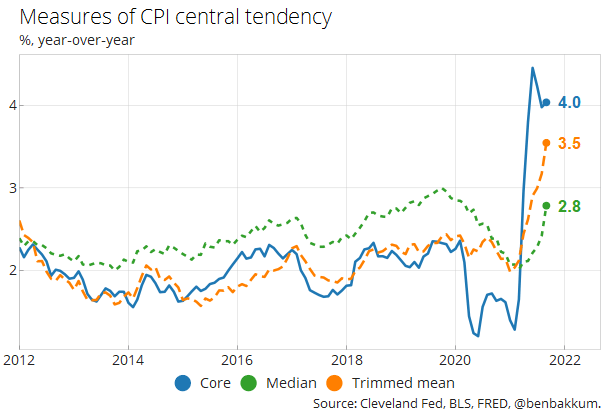
Most analysis of inflation data searches for a central tendency, “a signal in the noise,” that points to the future path of prices in the economy. Because of the volatility of food and energy prices, they often get stripped from overall price (headline) price indices, leaving a “core” index of the rest of the basket of prices to give a more consistent measure. Both headline and core inflation have shot up in 2021. Even other approaches to ferreting out the central tendency of price indices have climbed higher in recent months. Trimmed mean and median metrics for the Consumer Price Index (CPI), based on the inflation of components towards the middle of the distribution of all components’ rates of inflation, have inflected higher.
These series of the year-over-year rates of inflation can also be contextualized with the path of the index and price levels that underlie them. A dip in price levels and a later rebound creates a “base effect” boosting the year-over-year measure of change, even when the index resumes something close to its original trajectory. The beginning of the pandemic certainly saw a drop in prices, but the surge in 2021 has well surpassed even where index levels would have been expected to end up had they hypothetically maintained a steady 2% rate of increase over the last year and a half.
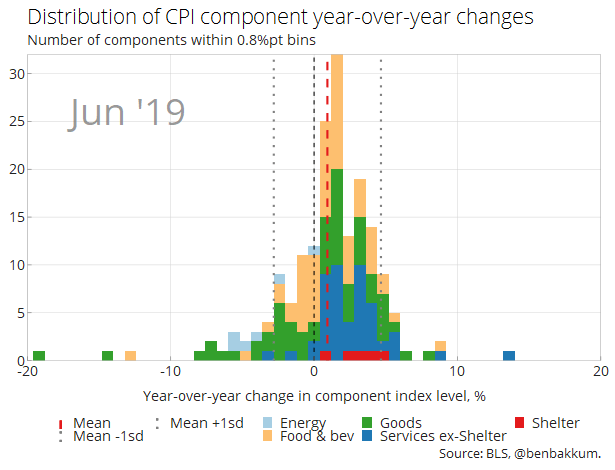
I also like looking at the distributions of components within CPI because it’s fun to watch, but also because it gives an idea of the level of dispersion between inflation for things as varied as men’s sweaters and medical services. In the chart below, I take 180 non-overlapping components of CPI and show the distribution of their year-over-year changes over time. Dispersion clearly increased with the onset of the pandemic and then amidst reopening, and since the summer the distribution has shifted to the right. Goods prices, which traditionally often decline over time, have strayed from deflationary territory and made up a large part of that shift, though services prices have also become increasingly skewed to the right.
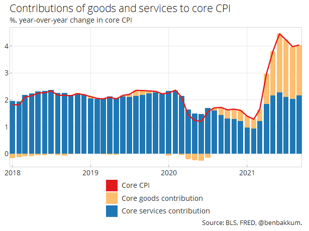
Looking at their contributions to the overall rate of year-over-year inflation provides a cleaner look at the relative trends of goods and services prices. Based on this perspective, core goods appear mostly responsible for the updraft in inflation that everyone’s talking about, while core services have maintained their longer-term trend.
I have a hunch that core goods will resume their longer-term trend as well. As can be seen in the chart below, the current jump in core goods prices flies in the face of decades of flatlining prices in the category. Structural forces of productivity growth, competition from abroad, and other factors have surely kept a lid on core goods prices this century, and I expect once the pandemic’s disruptions abate that those forces will reassert themselves.
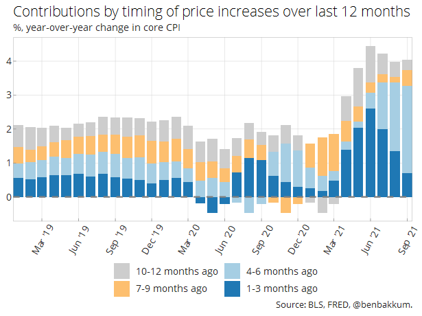
Another way to breakdown the year-over-year series of core CPI involves ascribing the overall change in its current level from the level 12 months ago to different periods in-between. In recent months, a deceleration can be seen in the declining contribution of the period of the trailing three months. The bulk of what has pushed the year-over-year inflation so high, however, came in the last six months, so this increase won’t roll off for another half of a year even if inflation continues to moderate.
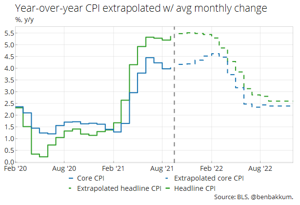
Assuming inflation doesn’t reaccelerate substantially from here, which I hold as my base case — though I’m cognizant of upside risks, especially in the form of housing prices — I would expect core CPI to slide back to around 2.5% by the middle of next year. The chart below extrapolates year-over-year inflation with the following months each exhibiting the average monthly rate of inflation of the last five years. Note that the Fed prefers to base its policy on the PCE price index, which would likely be even lower based on the smaller weight of housing in that index.
For reference, various rates of inflation for important components of CPI can be found in the table below.
| Mar-21 | Apr-21 | May-21 | Jun-21 | Jul-21 | Aug-21 | Sep-21 | |
|---|---|---|---|---|---|---|---|
| Headline CPI | |||||||
| m/m, % | 0.6 | 0.8 | 0.6 | 0.9 | 0.5 | 0.3 | 0.4 |
| 3m ann, % | 5 | 7.2 | 8.4 | 9.7 | 8.4 | 6.8 | 4.7 |
| y/y, % | 2.6 | 4.2 | 4.9 | 5.3 | 5.3 | 5.2 | 5.4 |
| Core CPI (~79) | |||||||
| m/m, % | 0.3 | 0.9 | 0.7 | 0.9 | 0.3 | 0.1 | 0.2 |
| 3m ann, % | 1.9 | 5.6 | 8.3 | 10.6 | 8.1 | 5.4 | 2.7 |
| y/y, % | 1.6 | 3 | 3.8 | 4.5 | 4.2 | 4 | 4 |
| Food (~14) | |||||||
| m/m, % | 0.1 | 0.4 | 0.4 | 0.8 | 0.7 | 0.4 | 0.9 |
| 3m ann, % | 1.4 | 2.6 | 3.8 | 6.4 | 7.8 | 7.6 | 8.1 |
| y/y, % | 3.4 | 2.3 | 2.1 | 2.4 | 3.4 | 3.7 | 4.5 |
| Energy (~7) | |||||||
| m/m, % | 5 | -0.1 | 0 | 1.5 | 1.6 | 2 | 1.3 |
| 3m ann, % | 62.2 | 40.8 | 21 | 5.5 | 13 | 22.3 | 21.4 |
| y/y, % | 13.2 | 25 | 27.8 | 24.2 | 23.6 | 24.9 | 24.8 |
| Core goods (~21) | |||||||
| m/m, % | 0.1 | 2 | 1.8 | 2.2 | 0.5 | 0.3 | 0.2 |
| 3m ann, % | 0.1 | 7.7 | 16.7 | 26.7 | 19.3 | 12.5 | 4.3 |
| y/y, % | 1.7 | 4.4 | 6.5 | 8.6 | 8.4 | 7.6 | 7.3 |
| Core services (~58) | |||||||
| m/m, % | 0.4 | 0.5 | 0.4 | 0.4 | 0.3 | 0 | 0.2 |
| 3m ann, % | 2.7 | 4.8 | 5.4 | 5.5 | 4.4 | 2.9 | 2 |
| y/y, % | 1.6 | 2.5 | 2.9 | 3.1 | 2.8 | 2.7 | 2.9 |
| Apparel (~3) | |||||||
| m/m, % | -0.3 | 0.3 | 1.2 | 0.7 | 0 | 0.4 | -1.1 |
| 3m ann, % | 4.7 | -2.8 | 5.1 | 9.3 | 8.1 | 4.5 | -2.8 |
| y/y, % | -2.5 | 1.9 | 5.6 | 4.9 | 4.2 | 4.2 | 3.4 |
| Used cars and trucks (~3) | |||||||
| m/m, % | 0.5 | 10 | 7.3 | 10.5 | 0.2 | -1.5 | -0.7 |
| 3m ann, % | -4.9 | 44.5 | 98.6 | 189.5 | 99.2 | 41.3 | -7.8 |
| y/y, % | 9.4 | 21 | 29.7 | 45.2 | 41.7 | 31.9 | 24.4 |
| Airline fares (~1) | |||||||
| m/m, % | 0.4 | 10.2 | 7 | 2.7 | -0.1 | -9.1 | -6.4 |
| 3m ann, % | -27.4 | 21.7 | 96.4 | 114.9 | 45 | -24.4 | -48 |
| y/y, % | -15.1 | 9.6 | 24.1 | 24.6 | 19 | 6.7 | 0.8 |
| Shelter (~33) | |||||||
| m/m, % | 0.3 | 0.4 | 0.3 | 0.5 | 0.4 | 0.2 | 0.4 |
| 3m ann, % | 2.2 | 3.5 | 4.1 | 4.8 | 5 | 4.4 | 4 |
| y/y, % | 1.7 | 2.1 | 2.2 | 2.6 | 2.8 | 2.8 | 3.2 |
| Medical care services (~7%) | |||||||
| m/m, % | 0.1 | 0 | -0.1 | 0 | 0.3 | 0.3 | -0.1 |
| 3m ann, % | 4.5 | 2.3 | 0.1 | -0.7 | 0.6 | 2.3 | 2.1 |
| y/y, % | 2.7 | 2.2 | 1.5 | 1 | 0.8 | 1 | 0.9 |
| Education (~3%) | |||||||
| m/m, % | -0.2 | 0.2 | 0.4 | 0.2 | 0.2 | 0 | 0.4 |
| 3m ann, % | 0.1 | 0.9 | 1.7 | 3.3 | 3.2 | 1.9 | 2.5 |
| y/y, % | 0.8 | 0.8 | 1 | 1.2 | 1.2 | 1.4 | 2 |
| Transportation services (~5%) | |||||||
| m/m, % | 1.8 | 2.9 | 1.5 | 1.5 | -1.1 | -2.3 | -0.5 |
| 3m ann, % | 5.5 | 19.7 | 27.6 | 26.3 | 7.9 | -7.4 | -14.4 |
| y/y, % | -1.6 | 5.7 | 11.3 | 10.3 | 6.2 | 4.5 | 4.4 |
|
Number next to component name represents its weight in the overall index. Coloring represents the degree of change in the rate of inflation from the month before. Source: BLS, @benbakkum. |
|||||||


