US Labor Market Update
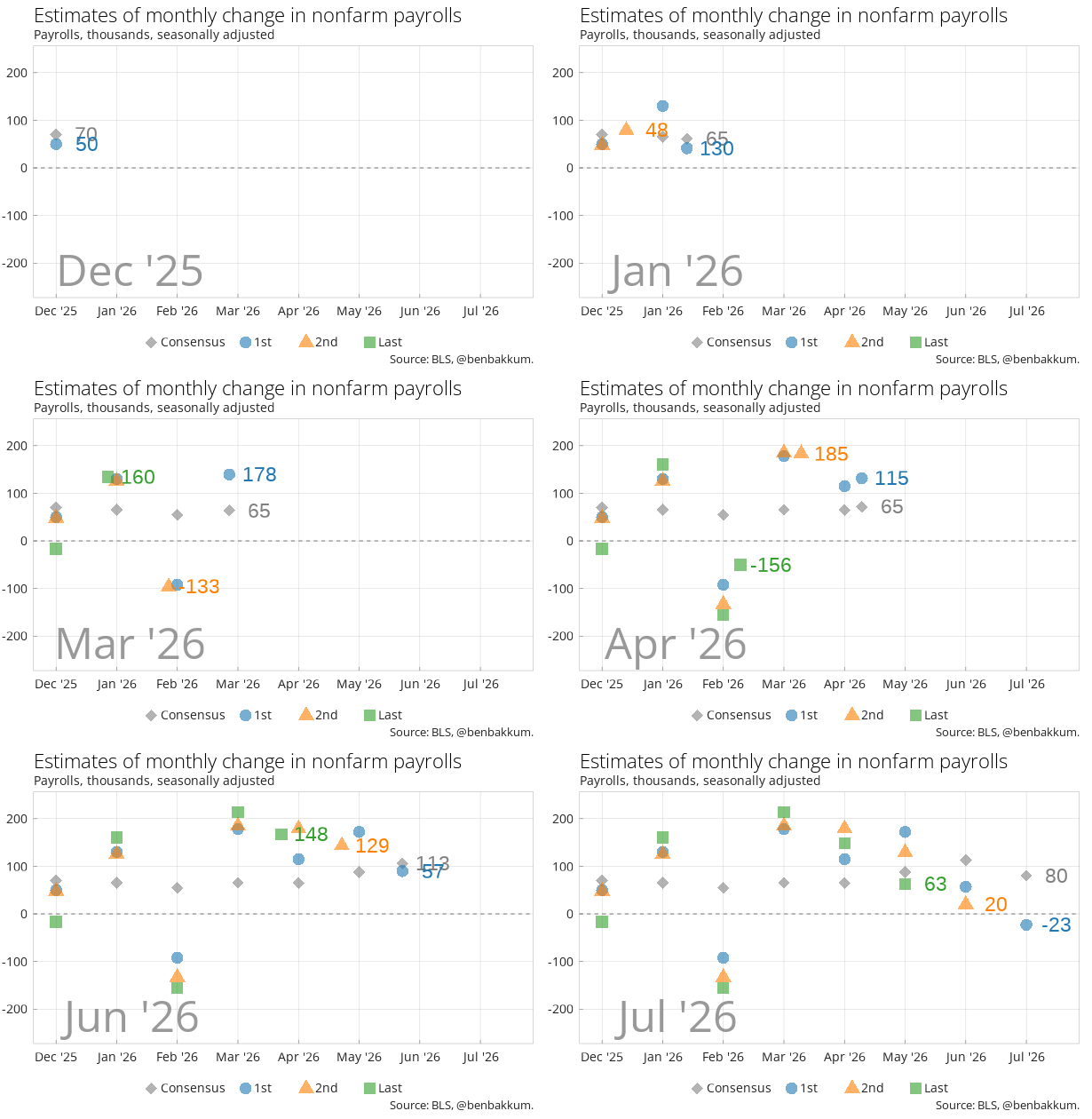
Nonfarm payrolls fell by 23k in July, the first monthly decline since February and well below the consensus estimate of a gain of about 80k. Government payrolls dropped by 53k, leisure and hospitality shed 40k, and retail lost 19k. Health care, the engine of job growth for the past two years, added just 22k, a fraction of its recent pace. The BLS also revised down its estimate for May by 66k (to a gain of 63k) and for June by 37k (to a gain of 20k), leaving the two months combined 103k lower than previously reported.
The chart below shows the evolution of estimates for monthly job gains/losses and later revisions (the “Last” estimate can represent either the final monthly revision or the annual benchmark revision, which tries to address drift in the sample of employers surveyed from reality due to business births and deaths). If anything, this chart illustrates the monthly payrolls figures’ ability to serve as a random number generator, being both difficult to forecast and heavily subject to revision.
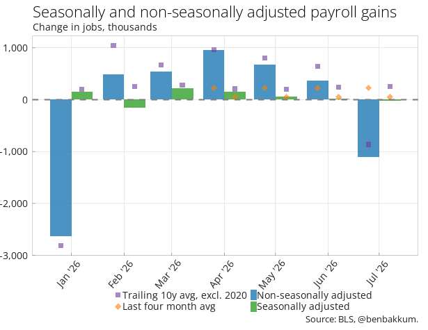
The actual net change in payrolls in July, without adjusting for seasonal effects, was a decline of about 1.1 million. July is reliably a big down month as education payrolls roll off for the summer, but this one was about a quarter deeper than the trailing 10 year average for July of roughly 860k (excluding 2020).
The chart below shows the actual (non-seasonally adjusted) and seasonally adjusted figures for the last seven months, along with the rolling 10 year average for that month of the year and the average of the last four months.
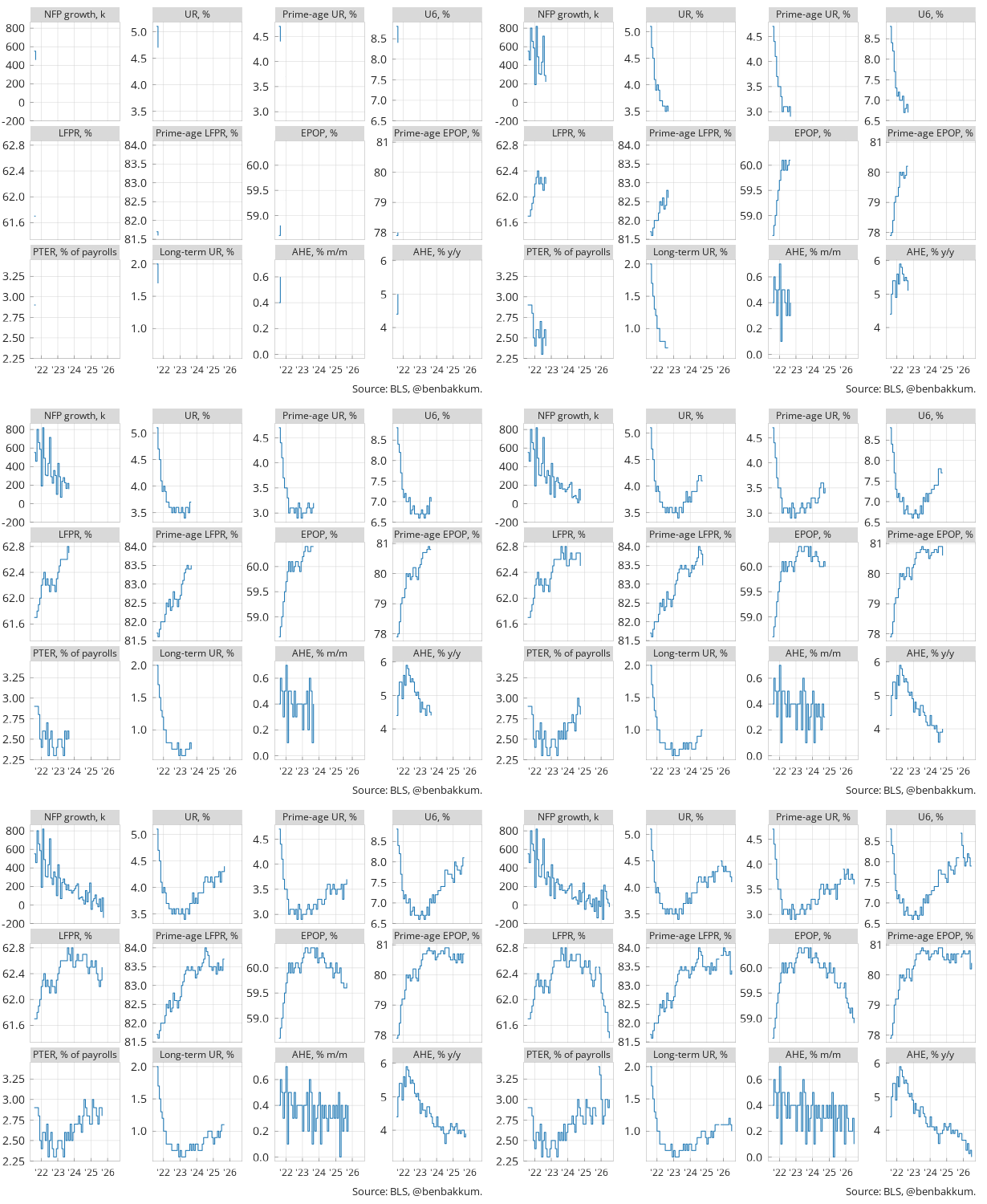
A quick guide to the table and charts below:
- NFP growth: the monthly change in total nonfarm payrolls, in thousands.
- UR: the unemployment rate, i.e. the share of people in the labor force who don’t have a job and are actively looking for one as a percentage of the labor force.
- Prime-age UR: the unemployment rate for 25-54 year olds, filtering out students and retirees. This to a large extent controls for changes in the UR due to demographic shifts.
- U6: the broader unemployment measure that also includes people who are marginally attached to the labor market, having looked for a job in the last 12 months but not in the last four weeks, and people stuck in part-time jobs who want full-time work.
- LFPR: labor force participation rate, the share of the civilian population that is either working or looking for work. The higher the labor force participation, the healthier the labor market.
- EPOP: the employment-to-population ratio. What share of the population has a job? This metric accounts for both employment and labor force participation in measuring job market conditions. That combo, along with stripping out some of the effects of demographics, makes prime-age EPOP arguably the most well rounded metric.
- PTER: part-time for economic reasons, people working part-time because they can’t find full-time work, as a share of total payrolls.
- Long-term UR: the share of unemployed workers who’ve been out of a job for 27 weeks or more.
- AHE: average hourly earnings. How much workers are getting paid per hour, shown both month-over-month and year-over-year.
July’s drop in the unemployment rate to 4.1% flatters the household survey: the labor force shrank by 264k and participation fell to 61.4%, its lowest in over five years, so fewer people counted as unemployed largely because fewer people counted at all. Wage growth was nearly flat on the month, with the year-over-year pace of average hourly earnings slipping to 3.2%, the slowest since May 2021. Prime-age EPOP ticking up two-tenths is the one genuinely firm-looking number in the set.
| Jan-26 | Feb-26 | Mar-26 | Apr-26 | May-26 | Jun-26 | Jul-26 | |
|---|---|---|---|---|---|---|---|
| NFP growth, k | 160 | -156 | 214 | 148 | 63 | 20 | -23 |
| UR, % | 4.3 | 4.4 | 4.3 | 4.3 | 4.3 | 4.2 | 4.1 |
| Prime-age UR, % | 3.8 | 3.9 | 3.7 | 3.7 | 3.8 | 3.7 | 3.6 |
| U6, % | 8.1 | 7.9 | 8 | 8.2 | 8.1 | 7.9 | 7.9 |
| LFPR, % | 62.1 | 62 | 61.9 | 61.8 | 61.8 | 61.5 | 61.4 |
| Prime-age LFPR, % | 84 | 83.9 | 83.8 | 83.8 | 83.9 | 83.3 | 83.4 |
| EPOP, % | 59.4 | 59.3 | 59.2 | 59.1 | 59.2 | 59 | 58.9 |
| Prime-age EPOP, % | 80.8 | 80.7 | 80.7 | 80.7 | 80.8 | 80.2 | 80.4 |
| PTER, % of payrolls | 3 | 2.7 | 2.8 | 3 | 3 | 2.9 | 3 |
| Long-term UR, % | 1.1 | 1.1 | 1.1 | 1.1 | 1.2 | 1.1 | 1 |
| AHE, % m/m | 0.4 | 0.3 | 0.2 | 0.2 | 0.2 | 0.3 | 0.1 |
| AHE, % y/y | 3.7 | 3.7 | 3.4 | 3.6 | 3.3 | 3.4 | 3.2 |
| Source: BLS, @benbakkum. |
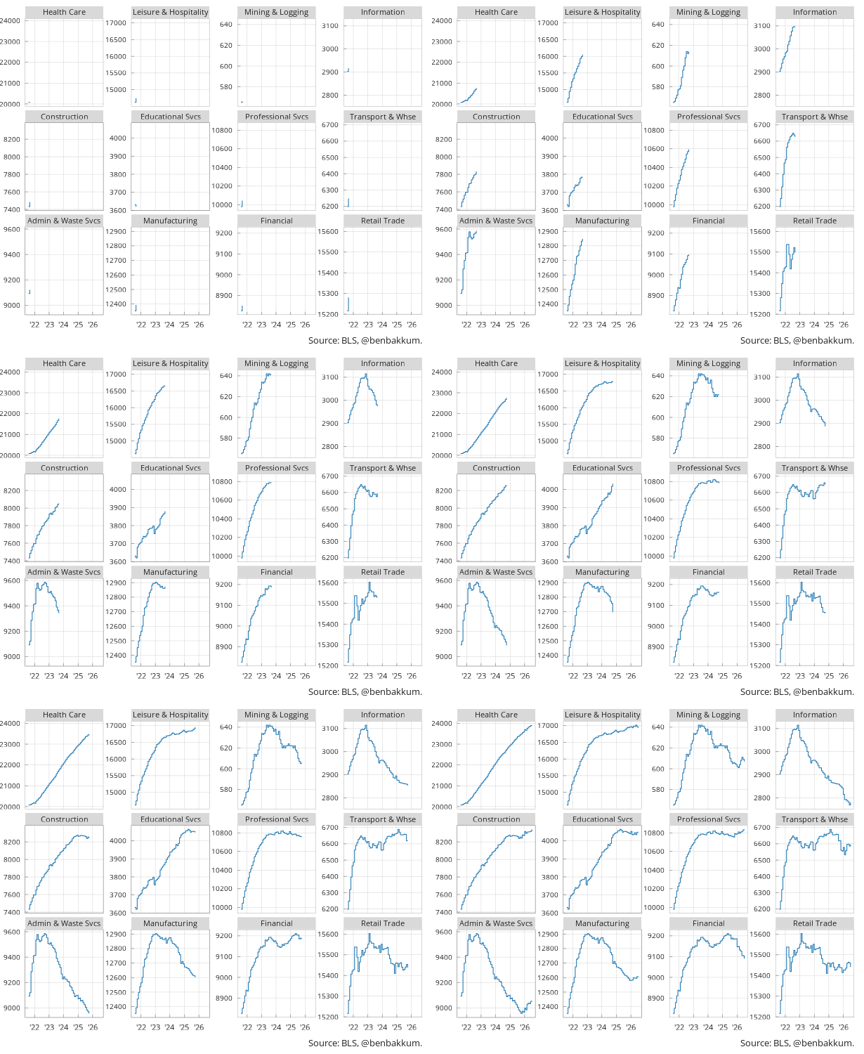
Looking at longer-term trends across industries, the post-pandemic labor market has been defined by a lopsided recovery. Health care has been the dominant driver of job growth among the industries below, while goods-producing sectors like manufacturing and mining have been flat to declining. Leisure and hospitality, which bore the brunt of pandemic layoffs, has largely recovered but job growth there has stalled. Information sector employment, which the BLS defines as publishing (including software), film and sound recording, broadcasting, telecom, and data processing, has trended lower since the over-hiring of the pandemic recovery.
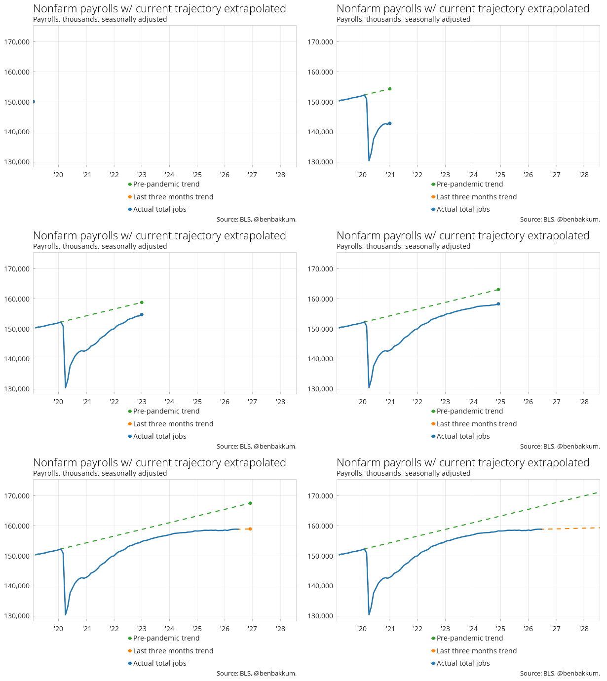
The flattish job growth of 2025 and 2026 (so far) has widened the gap between current overall employment and levels in the unlikely case the pre-pandemic trend of job growth had continued.
An aggregate measure of labor market conditions, the Blanchflower-Levin employment gap, shows that tightness in the labor market has dissipated. Labor market “tightness,” or conversely “slack,” represents how close job market conditions are to what would be expected based on demographics, without either a glut of job opening or unemployed.
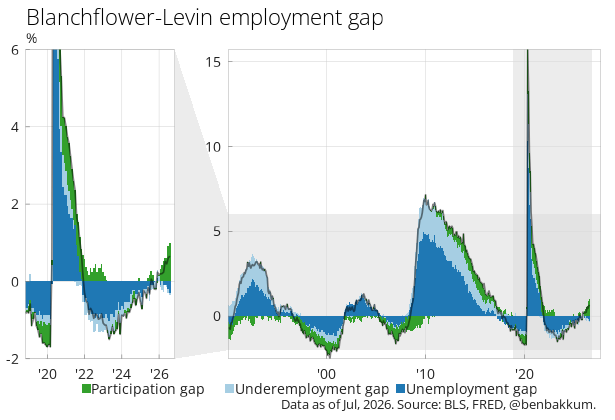
The various measures of tightness/slack above include:
- Unemployment gap: the difference between the unemployment rate and an estimate of the non-accelerating inflation rate of unemployment (NAIRU). NAIRU is a rough estimate of the level of unemployment that neither places upward or downward pressure on inflation.
- Participation gap: the difference between the labor force participation rate (LFPR) and the Congressional Budget Office’s estimate of the potential LFPR. The CBO’s “potential” version is their best guess at what that number should be given demographics (aging population, school enrollment etc). When actual participation falls below potential, it suggests there are people on the sidelines who would normally be in the workforce.
- Underemployment gap: the difference between the number of employees working part-time for economic reasons as a percentage of the labor force, adjusted for the difference in average hours worked by part-time and full-time employees, and the 1994-2007 average of this calculation.
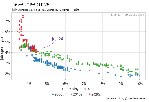
The chart below shows the Beveridge curve, plotting the job openings rate (y-axis) against the unemployment rate (x-axis). It illustrates the inverse relationship between the two. When there are many openings as a percentage of the labor force, unemployment tends to be low, and vice versa. Recent data sits on a kink in the curve, suggesting that were the openings rate to continue to fall, the unemployment rate may increase at a faster pace.