
Prices -> They're rising a lot
The US Consumer Price Index numbers for November were a bit anticlimactic as they were essentially inline with analyst expectations, but the levels of inflation are certainly quite anamolous from a historical perspective. Headline and core CPI came in at 6.8% and 4.9% respectively. That’s the fastest rate of headline inflation since 1982.
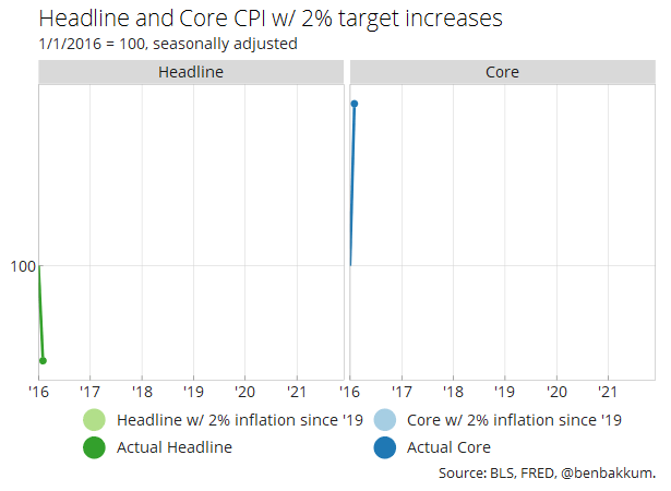
Year-over-year rates of inflation can be contextualized with the path of the index and price levels that underlie them. A dip in price levels and a later rebound creates a “base effect” boosting the year-over-year measure of change, even when the index resumes something close to its original trajectory. The beginning of the pandemic certainly saw a drop in prices, but the surge in 2021 has far surpassed even where index levels would have been expected to end up had they hypothetically maintained a steady 2% rate of increase over the last year and a half.
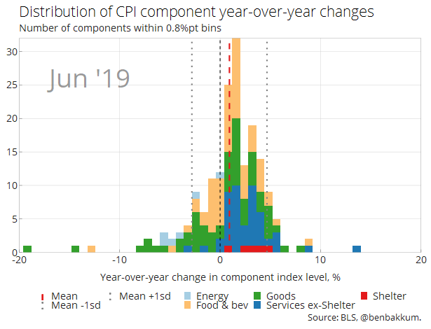
I also like looking at the distributions of components within CPI because it’s fun to watch, but also because it gives an idea of the level of dispersion between inflation for things as varied as men’s sweaters and medical services. In the chart below, I take 180 non-overlapping components of CPI and show the distribution of their year-over-year changes over time. Dispersion clearly increased with the onset of the pandemic and then amidst reopening, and since the summer the distribution has shifted to the right. It’s striking how few components’ prices are declining on a year-over-year basis right now.
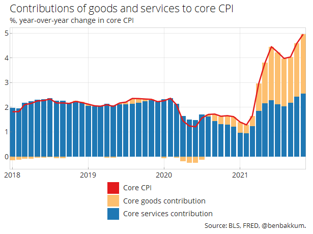
Looking at their contributions to the overall rate of year-over-year inflation provides a cleaner look at the relative trends of goods and services prices. Based on this perspective, core goods appear mostly responsible for the updraft in inflation that everyone’s talking about, though core services’ contribution has steadily increased over the last three months.
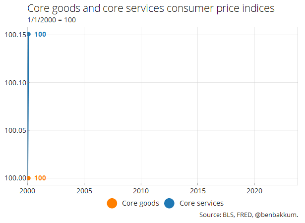
As can be seen in the chart below, the current jump in core goods prices flies in the face of decades of flatlining prices in the category. Structural forces of productivity growth, competition from abroad, and other factors have surely kept a lid on core goods prices this century, and I expect once the pandemic’s disruptions abate that those forces will reassert themselves.
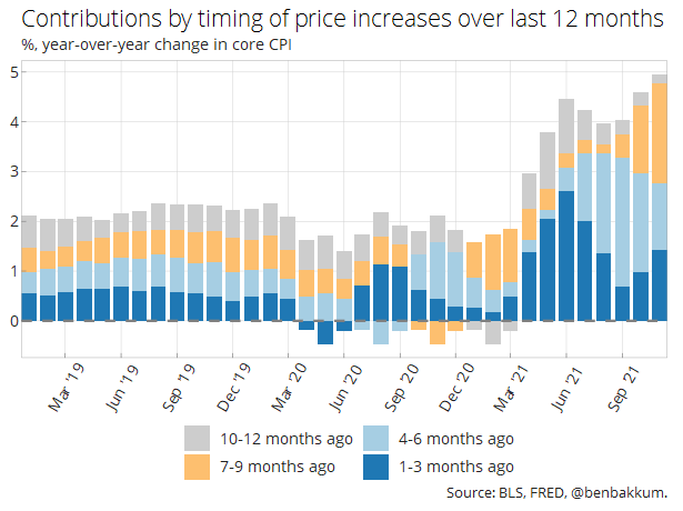
Another way to breakdown the year-over-year series of core CPI involves ascribing the overall change in its current level from the level 12 months ago to different periods in-between. The bulk of what has pushed the year-over-year inflation so high came in the last nine months, so this much of this increase won’t begin to roll off for another several months even if inflation moderates from here.
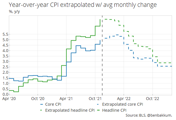
Assuming inflation doesn’t further accelerate substantially from here, which I hold as my base case — though I’m cognizant of upside risks, especially in the form of housing prices — core CPI may slide back to even around 2.5% by late next year. The chart below extrapolates year-over-year inflation with the following months each exhibiting the average monthly rate of inflation of the last five years. Note that the Fed prefers to base its policy on the PCE price index, which would likely be even lower based on the smaller weight of housing in that index.
For reference, various rates of inflation for important components of CPI can be found in the table below.
| May-21 | Jun-21 | Jul-21 | Aug-21 | Sep-21 | Oct-21 | Nov-21 | |
|---|---|---|---|---|---|---|---|
| Headline CPI | |||||||
| m/m, % | 0.6 | 0.9 | 0.5 | 0.3 | 0.4 | 0.9 | 0.8 |
| 3m ann, % | 8.4 | 9.7 | 8.4 | 6.8 | 4.7 | 6.7 | 8.9 |
| y/y, % | 4.9 | 5.3 | 5.3 | 5.2 | 5.4 | 6.2 | 6.9 |
| Core CPI (~79) | |||||||
| m/m, % | 0.7 | 0.9 | 0.3 | 0.1 | 0.2 | 0.6 | 0.5 |
| 3m ann, % | 8.3 | 10.6 | 8.1 | 5.4 | 2.7 | 3.8 | 5.6 |
| y/y, % | 3.8 | 4.5 | 4.2 | 4 | 4 | 4.6 | 5 |
| Food (~14) | |||||||
| m/m, % | 0.4 | 0.8 | 0.7 | 0.4 | 0.9 | 0.8 | 0.7 |
| 3m ann, % | 3.8 | 6.4 | 7.8 | 7.6 | 8.1 | 8.7 | 9.9 |
| y/y, % | 2.1 | 2.4 | 3.4 | 3.7 | 4.5 | 5.1 | 5.8 |
| Energy (~7) | |||||||
| m/m, % | 0 | 1.5 | 1.6 | 2 | 1.3 | 4.8 | 3.5 |
| 3m ann, % | 21 | 5.5 | 13 | 22.3 | 21.4 | 37.1 | 45.3 |
| y/y, % | 27.8 | 24.2 | 23.6 | 24.9 | 24.8 | 30 | 33.5 |
| Core goods (~21) | |||||||
| m/m, % | 1.8 | 2.2 | 0.5 | 0.3 | 0.2 | 1 | 0.9 |
| 3m ann, % | 16.7 | 26.7 | 19.3 | 12.5 | 4.3 | 6.6 | 9.3 |
| y/y, % | 6.5 | 8.6 | 8.4 | 7.6 | 7.3 | 8.5 | 9.4 |
| Core services (~58) | |||||||
| m/m, % | 0.4 | 0.4 | 0.3 | 0 | 0.2 | 0.4 | 0.4 |
| 3m ann, % | 5.4 | 5.5 | 4.4 | 2.9 | 2 | 2.8 | 4.3 |
| y/y, % | 2.9 | 3.1 | 2.8 | 2.7 | 2.9 | 3.3 | 3.4 |
| Apparel (~3) | |||||||
| m/m, % | 1.2 | 0.7 | 0 | 0.4 | -1.1 | 0 | 1.3 |
| 3m ann, % | 5.1 | 9.3 | 8.1 | 4.5 | -2.8 | -2.9 | 0.6 |
| y/y, % | 5.6 | 4.9 | 4.2 | 4.2 | 3.4 | 4.3 | 5 |
| Used cars and trucks (~3) | |||||||
| m/m, % | 7.3 | 10.5 | 0.2 | -1.5 | -0.7 | 2.5 | 2.5 |
| 3m ann, % | 98.6 | 189.5 | 99.2 | 41.3 | -7.8 | 0.9 | 18.5 |
| y/y, % | 29.7 | 45.2 | 41.7 | 31.9 | 24.4 | 26.4 | 31.4 |
| Airline fares (~1) | |||||||
| m/m, % | 7 | 2.7 | -0.1 | -9.1 | -6.4 | -0.7 | 4.7 |
| 3m ann, % | 96.4 | 114.9 | 45 | -24.4 | -48 | -49 | -10.1 |
| y/y, % | 24.1 | 24.6 | 19 | 6.7 | 0.8 | -4.6 | -3.7 |
| Shelter (~33) | |||||||
| m/m, % | 0.3 | 0.5 | 0.4 | 0.2 | 0.4 | 0.5 | 0.5 |
| 3m ann, % | 4.1 | 4.8 | 5 | 4.4 | 4 | 4.2 | 5.6 |
| y/y, % | 2.2 | 2.6 | 2.8 | 2.8 | 3.2 | 3.5 | 3.9 |
| Medical care services (~7%) | |||||||
| m/m, % | -0.1 | 0 | 0.3 | 0.3 | -0.1 | 0.5 | 0.3 |
| 3m ann, % | 0.1 | -0.7 | 0.6 | 2.3 | 2.1 | 2.9 | 2.6 |
| y/y, % | 1.5 | 1 | 0.8 | 1 | 0.9 | 1.7 | 2.1 |
| Education (~3%) | |||||||
| m/m, % | 0.4 | 0.2 | 0.2 | 0 | 0.4 | 0.2 | 0.2 |
| 3m ann, % | 1.7 | 3.3 | 3.2 | 1.9 | 2.5 | 2.4 | 3.1 |
| y/y, % | 1 | 1.2 | 1.2 | 1.4 | 2 | 2 | 2.1 |
| Transportation services (~5%) | |||||||
| m/m, % | 1.5 | 1.5 | -1.1 | -2.3 | -0.5 | 0.4 | 0.7 |
| 3m ann, % | 27.6 | 26.3 | 7.9 | -7.4 | -14.4 | -9.3 | 2.3 |
| y/y, % | 11.3 | 10.3 | 6.2 | 4.5 | 4.4 | 4.5 | 3.9 |
|
Number next to component name represents its weight in the overall index. Coloring represents the degree of change in the rate of inflation from the month before. Source: BLS, @benbakkum. |
|||||||


